
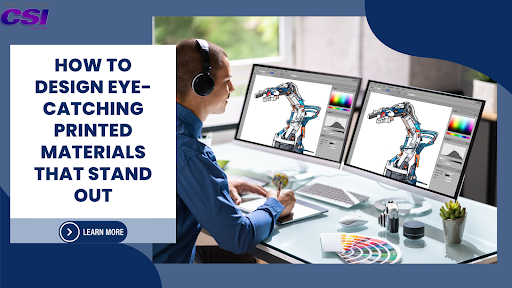
How to Design Eye-Catching Printed Materials That Stand Out
Effective printed materials rely on strong visual hierarchy, readable typography, high-resolution images, and consistent branding to attract attention and communicate clearly.
Design elements such as color, spacing, contrast, and layout play a key role in guiding the viewer’s focus and creating a memorable impression.
Choosing the right format—like banners, wall murals, or trade show graphics—based on the setting and audience can significantly improve the impact of your printed materials.
A printed design can stop someone mid-step or be passed over without a second glance. In crowded trade shows, busy storefronts, or vibrant event venues, standing out is not just helpful—it’s vital. A well-designed printed piece can capture interest, hold attention, and support your message without saying a word. It speaks through color, layout, typography, and material.
Let’s explore how to design printed materials that get noticed. Whether you are preparing for a trade show, promoting a retail offer, or decorating a commercial space, you’ll find valuable direction here. We’ll also walk through examples where good design meets expert production using services like wall murals, point-of-purchase displays, pop-up exhibits, banners, and more.
Know the Purpose of the Material
Before starting the design, define what the printed piece needs to achieve. Is it meant to inform, promote, decorate, or guide? Every design choice will depend on this goal. For example, a point-of-purchase display in a retail store needs to highlight the product and direct attention toward it. A trade show graphic, on the other hand, needs to draw people in from a distance.
Understanding the purpose helps shape the content, size, layout, and even material. This clarity will also support decisions during the printing phase, especially when working with large-format items like banners, fabric prints, and vehicle graphics.
Focus on Readability and Layout
The message should be concise and easy to understand. People typically spend only a few seconds looking at a sign or display, especially in fast-paced settings such as expos or retail locations. Clear headlines, large fonts, and balanced spacing help improve readability.
Avoid cramming too much text into a small area. Use white space to create breathing room. This not only improves reading but also directs the eye through the design. A clean layout improves impact and makes your design more effective, whether it's for oversized prints, murals, or posters.
Choose the Right Colour Scheme
Color plays a major role in how your material is noticed and remembered. Use bold, contrasting colors to make important elements pop. Stick to a consistent palette that matches your brand identity.
Think about where the material will be displayed. Indoor lighting and outdoor sunlight affect how colors appear. For example, fabric prints used at outdoor events may need brighter tones to remain visible under sunlight, while interior murals can use subtler shades to match the space.
Also, always design in CMYK (cyan, magenta, yellow, black) when preparing files for print. This is the standard format for printers and helps match the colors on screen with what will be printed.
Use High-Quality Images and Graphics

Low-resolution images will appear pixelated or blurry when printed, especially on large surfaces. Always use high-resolution files (at least 300 DPI) and vector graphics when possible. This is important for vehicle wraps, oversized prints, and pop-up displays where every detail counts.
Professional photography or custom illustrations work best. Avoid clip art or images pulled from the internet, as they may not print well and could lead to legal issues. At CSI Printing & Graphics, each design is reviewed for quality before printing to avoid these common problems.
Keep the Message Simple
A strong message is direct and concise. Stick to one key point or call-to-action. Overloading a design with too many messages can confuse viewers and reduce the overall impact.
Use headlines and subheadings to organize information. Support your message with a short, clear statement. For example, a tradeshow graphic might feature a simple phrase like “Print That Pops” with a website address or QR code underneath.
Minimal text is especially important for banners and displays meant to be seen from a distance. The fewer the words, the faster people understand what you’re offering.
Match the Design to the Material and Format
Different materials behave in different ways. Fabric absorbs ink differently than vinyl. Wall murals need to work with the shape and texture of the wall. Vehicle wraps must follow the curves and contours of the surface.
The design should consider how it will be printed and installed. Avoid placing important text near the edges where it could get trimmed or wrapped. For banners, allow space for grommets. For pop-up displays, align key visuals to stay within the visible area.
At CSI Printing & Graphics, our team helps clients make the right material choices based on design and use. This collaboration avoids errors and improves the final look of the product.
Use Typography That Stands Out
The right typeface can make or break your design. Choose fonts that are clean, bold, and easy to read from a distance. Avoid decorative or thin fonts for large displays or signage.
Limit yourself to two or three font styles in one design. Too many fonts make the design look cluttered and confuse the hierarchy of information. Use size, weight (bold vs. regular), and color to guide the reader’s eye.
Typography is especially important in point-of-purchase displays, where the message needs to guide quick buying decisions. A strong headline and product benefit in bold text can make a real difference.
Use Visual Hierarchy to Guide Attention
Visual hierarchy refers to the way elements are arranged so that the viewer naturally sees the most important parts first. This is done using size, position, color, and contrast.
The headline should be the largest and most noticeable element. Supporting information should be smaller but still visible. Calls to action (such as “Visit Booth 21” or “Buy Now”) should stand out using color or placement.
This strategy is useful across all printed formats—banners, posters, fabric prints, and tradeshow displays. It helps viewers quickly understand the content and take action if needed.
Design for the Viewing Distance
Printed designs should be scaled for how far away they’ll be seen. A small poster, read up close, can use smaller fonts and fine details. But a banner viewed from across a room or a vehicle wrap seen on the road needs large elements and bold contrast.
Here’s a simple guideline: the farther away the viewer, the larger the text and graphics need to be. This is especially true for large-format printing, where the design must work at scale.
We guide our clients on appropriate font sizes and layout based on the intended viewing distance. This helps designs remain effective no matter where they’re displayed.
Keep Branding Consistent
Every printed piece is a chance to strengthen your brand. Use your brand’s colors, fonts, logos, and voice consistently across all materials. This helps customers recognize your business wherever they see it.
Consistency builds trust and familiarity, especially for retail businesses, event organizers, and B2B brands that use multiple types of printed materials. Whether it’s a wall mural inside your store or a tradeshow graphic at a large expo, the visual language should feel connected.
Make sure your logo is placed clearly, but not so large that it takes attention away from the message. Balance is key.
Proof and Prepare Files Correctly
Before sending a file to print, double-check every detail. Misspelled words, poor alignment, or missing graphics can ruin the impact of your design and cost you time and money to fix.
Use crop marks, correct bleed settings, and proper color formats. Convert fonts to outlines when needed, and embed all images. Print-ready files make the process faster and more accurate.
Our production team reviews each file before printing. We work with clients to adjust files when needed, reducing errors and improving results.
Test the Design in Real Settings
Whenever possible, test your design at actual size. Print a sample or use a mock-up to see how it looks in the intended environment. This helps spot layout issues, font size problems, or color mismatches.
Seeing the design in context gives you a clearer idea of how it will work in real life. This is especially helpful for custom wall murals, tradeshow booths, or vehicle graphics where every inch matters.
Final Thoughts
Printed materials can be powerful tools for business visibility, marketing, and customer engagement—if they are designed well. Each element—color, layout, typography, material—should be chosen with purpose. The final product must be readable, visually strong, and aligned with your brand.
From display graphics and vehicle wraps to pop-up exhibits and large-format signs, CSI Printing & Graphics helps businesses create print solutions that work. Our process brings creativity and professionalism together, making printing both effective and fun. We understand the demands of retail, expos, hospitality, and events, and we design with these needs in mind. Partner with us to bring your ideas to life with clarity, impact, and precision.